

Messenger App
Project Focus: UI/UX
Year: 2018
Factory Bucket Project
Project Overview
I was tasked with conceptualizing a mobile messenger feature that would provide users with a communication tool within our enterprise software. Our goal was to create a network effect that could increase our team's sales opportunities within a growing user-base. We decided to explore a mobile-first design with the intention of building a web version after. Unfortunately, this project was sidelined in favour of other opportunities.
Project Focus & Timeline
UI/UX Design
3 weeks
Role & Responsibilities
Visual Designer
Information architecture, visual design, interaction design.
Problem
Over the past two years working with our audience of manufacturing employees in the front office, we have seen various methods of slow communication tools like email and phone used to talk to their team internally, as well as their suppliers and customers. Waiting days for email responses for simple questions or talking on the phone and not having a record of what was said allows information and potential revenue to be lost.
Solution Hypothesis
I believe a mobile messenger app will provide users with a tool for quick communication and collaboration with their colleagues, suppliers and outside service providers. This will drastically reduce or eliminate the need for email or phone communication. Users can get quicker responses about their work within the software they are using daily to run their operations. I will know this to be true when we get positive feedback from users.
Business Objectives
Get customers to invite their vast network of suppliers to the messenger app for free, growing the Factory Bucket network, increasing exposure and opportunities for sales within a growing user-base.
User Objectives
Reduce the need for phone calls and long-awaited email responses
Give users the ability to connect with their colleagues, suppliers and logistics carriers from anywhere
Persona
Based on our constant communication with the client and hearing the problem mentioned over and over, we decided to move forward with creating a persona to synthesize our user’s pain points and help us empathize with them.
Information Architecture
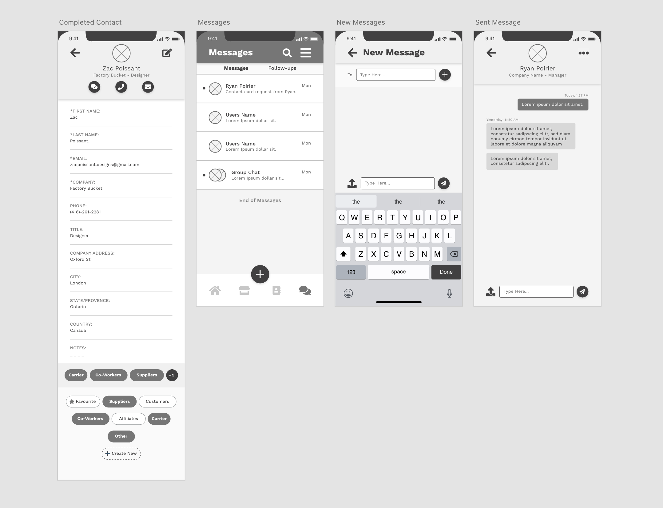
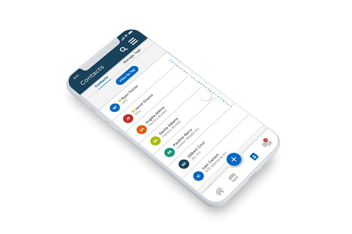
After a group card sorting activity, I created a site map to visualize what ideas belong where. One of those ideas was a tag system that would allow users to organize their contacts into groups. An example of a group might be users colleagues, different departments within an organization, suppliers, etc. This feature is echoed throughout the messenger feature, allowing users to filter by various tags when selecting a contact to message.
I found that messages and tasks can often get lost in a chat, never to be seen again. Our solution was follow-ups, a way to identify a subject discussed in a message and create a reminder about a particular message.
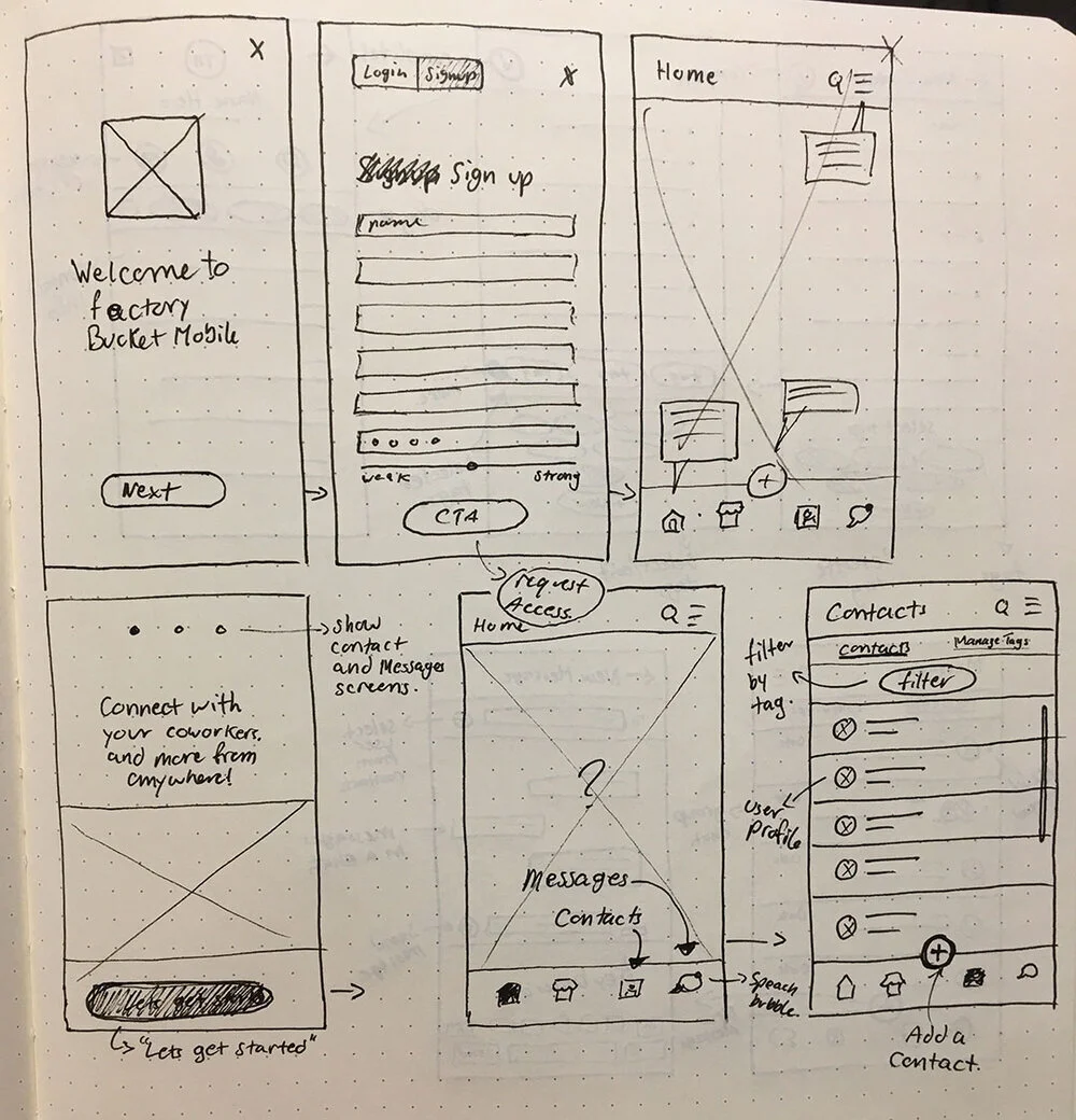
Task Flow
The task flow below demonstrates how a user would go from discovering the app, to adding their first contact and
sending a message.
Product Ideation
The sketches show the early ideations on how a user might complete the task flow.
Low Fidelity Wireframe
Greyscale mockups allow me to get feedback from the stakeholders and users, without the distraction of colours
and branding.
Visual Design
The colour scheme and UI elements were pulled from our (Factory Bucket) brand guidelines and design systems that two other designers and myself have built up over the past two years (2017-2018). To differentiate the parent pages I decided to use our dark blue header bar while the child pages have a white header bar. This is a common design theme in other applications I looked at when researching competitors and gives the users a better sense of where they are within
the application.
Creating a new contact
First, our persona Jackie will click the blue plus button to create a new contact. Second, she enters all required fields in the contact card and selects and/or creates tags to categorize her new contact. This will help when searching for this contact in the future and allow Jackie to filter based on the tags she has created. Once Jackie has satisfied the required fields, the checkmark in the top right corner can be clicked to save this contact.
Sending a message
Jackie can click on an existing message or click the blue plus button to start a new message. From the new message screen, Jackie can search for contacts or filter by tag to find the contact she is looking for. For example, Jackie may be looking for one of her suppliers or logistics carriers to check on the status of a shipment. Once Jackie selects a contact she can send a message. To make this a group chat, Jackie can select the icon in the top right corner of the screen to add additional recipients.
Micro Interactions
Reflection
As I mentioned in the overview, this project was set aside to focus our efforts elsewhere. The purpose was to conceptualize an idea that would hopefully create a network effect by users adding their vast network of suppliers onto the messenger app for free, resulting in more sales opportunities, as well as to provide our users with an easy communication tool within the software they are already using. This project didn’t move forward because the pain points our users faced didn’t justify the development at this time.
If I had more time, I would love to lead a usability test with our users to validate our assumptions and further iterate on this feature until we receive positive feedback that satisfies or disproves our hypothesis.