
No-Code App
Project Focus: UI/UX
Year: 2020/2021
Factory Bucket Project
Project Overview
I’ve had the opportunity to work with a talented team of product managers and developers on an exciting no-code enterprise product positioned to help the manufacturing industry rapidly build custom enterprise software solutions.
Project Focus & Timeline
UI/UX Design
April 2020 - Present
Role & Responsibilities
Sole UI/UX Designer
UX research, information architecture, visual design, usability testing.
Tools Used
Figma, Tailwind CSS
Team & Year
Factory Bucket
No-code product team.
2020/2021
Problem
1. Disconnected ERP
Manufacturers use a variety of disconnected Enterprise Resource Planning (ERP) software to manage their business.
2. Rigid software
Manufacturers have unique challenges and processes that don’t fit rigid ERP software. They are forced to change their process to match the software.
3. ERP solutions are slow & costly
ERP implementation is time-consuming, very costly and is often unsuccessful in meeting company goals.
4. Custom solutions are expensive
Large manufacturers have the financial capacity to pay for custom solutions, but for many, custom software development takes too long and is too expensive.
Challenge
How might we design a product that fills in the gaps left by traditional ERP software, adapts to any business process, is less expensive and easier to implement than current ERP software?
Solution Hypothesis
We believe manufacturers need a software solution that adapts to any business process, integrates with their existing software tools to provide them with visibility into their organization, automates workflows and builds custom solutions for unique problems. We will know this to be true when our assumptions are validated by user research and design validated by usability testing.
Our solution is a No-Code Enterprise application that will allow Factory Bucket employees and eventually third-party implementors to rapidly create custom software solutions without writing a single line of code.
Objectives
The application should be flexible enough to meet the unique needs of each customer.
The application should allow us to create custom solutions for clients at scale without code,
thereby reducing our clients cost and timeline.The application should have the ability to integrate with software that is commonly used by manufacturers
The application should allow us to build multiple apps, giving us the ability to create a complete enterprise platform
The application should provide no-code users with a user-friendly solution with a modern design. This will help us compete with larger, but older and more complicated competitors.
Competitive Analysis
My first task was to learn about competing no-code applications by doing a competitive analysis. I researched things like pricing, market positioning, strengths and weaknesses. This gave me a better understanding of what no/low-code was all about and helped me form my own assumptions and identify possible opportunities to gain a competitive advantage. I concluded by presenting my findings to my team where we had a constructive conversation and generated feature ideas.
Inspirational Software
Throughout the design process, I took inspiration from an array of products like Knack, Retool, Webflow, Integromat and others, as well as design platforms like Dribble and Pinterest for visual design inspiration. I have learned the value of drawing inspiration from many sources when ideating solutions. From there I can wireframe a handful of ideas, present them to my team for feedback and narrow down conceptual renders to reach a high-fidelity solution.

Assumptions
We assume users should start with an existing page template as a starting point rather than a blank canvas.
We assume users might prefer simple page layout templates rather than robust visual editing tools.
We assume users will require multiple apps within a single client space to create a full enterprise solution.
We assume users should have the freedom and flexibility to build their app in any way they prefer. We shouldn’t be forcing any particular step to be completed first.
We assume users will require the ability to integrate with common enterprise software like SAP, Oracle etc.
Given their older demographics, we assume most manufacturers will not have the technical skills to build an application using our no-code tool and would rather have us (Factory Bucket), or a third party implementer, build a custom app on their behalf. Therefore our target users are no-code users, not manufacturers.
User Interviews & Survey
Further understanding the problem and uncovering potential solutions
To further understand the problem and validate our assumptions, I created a survey which I sent to no-code users through community slack channels, various Facebook groups and other online no-code community forums. To vet participants, I asked preliminary questions to make sure they have experience with no-code tools.
I also conducted 4 user interviews with candidates that matched our no-code user audience. Talking to real people helped me empathize with their pain points and better understand what features they value in a no-code application.
I learned that no-code users value customization when it comes to building a UI. Our assumption that users might prefer using basic page templates, rather than having full control over layout and customization for the sake of simplicity, was wrong. No-code users require more customization to successfully meet their client’s requirements. Users often hit roadblocks with other app builders, requiring them to write code to retrofit a rigid solution or use a combination of services to achieve their client’s request.
Persona
To synthesize my findings and empathize with my interviewees, I added insights gained in the interview stage to the Implementer persona that my team already outlined. The persona helped my team and I confidently ideate solutions while keeping in mind the needs of no-code users.
Information Architecture
Next, I worked with my team to create a site map and listed important actions under each page. This helped my team and I visualize how the system would be set up, allowed us to collaborate on ideas and most importantly aligned our vision and gave us a common understanding of the work to be done.

Exploration
Once the IA was complete, I started exploring a wide range of high-level layout ideas for primary pages. My team and I kick-off a feature by discussing the objectives and ideate possible solutions. My next step is to sketch our ideas, then present them back to the team for further refinement. Once we’re happy with the direction, I’ll mock-up a low-fidelity prototype and continue the iteration and refinement process.
Concepts for our primary navigation
Notifications page concepts
Views (page builder) panel concepts
Views (page builder) concept
Visual programming language concepts
Visual programming language panel concept
Refining
After meeting with my team for feedback on initial sketches, I mocked-up the refined ideas with a low-fidelity, grayscale prototype. The lack of colour early on, helped us focus on the layout without getting distracted by the visuals. My next step was presenting the low-fidelity prototype to my team, further iterating on the design and ultimately validating our design through usability testing.
Primary Navigation slid open idea
Visual programming language iteration
Views (Page Builder) iteration
If I had to do it all again, I would create lower-fidelity wireframes to start. I probably spent more time than needed making these early concepts look good when I should have focused on rapid iterations to reach a high-fidelity design faster, while limiting the time it took to make changes early on.
Usability Testing
My next step was to validate our greyscale prototype by testing it with 3-5 no-code users. I manually recruited participants by reaching out with a screener survey on various no-code forums, Facebook groups, and Slack community chats. The screener survey helped vet participants and gave me insights into their no-code experience.
Study Objectives:
Observe an experienced no-code user using our prototype for the first time. Are they able to find things quickly to complete their objectives? Is the design intuitive? Particularly the navigation and other high-level areas of the application.
Do users understand when they are in a workspace or not?
Summary of Findings:
I learned that our primary navigation needed a redesign and shouldn’t change to reflect two sets of navigation. The issues with the navigation caused other problems like confusion about whether or not a user was in a Workspace. I learned that the sidebar navigation should be static, rather than expanding when hovered over. Participants found they would often accidentally open the navigation. I learned that the Views (page builder) canvas area needed to be more prominent to distinguish it from the rest of the page.
Multi-level navigation bar
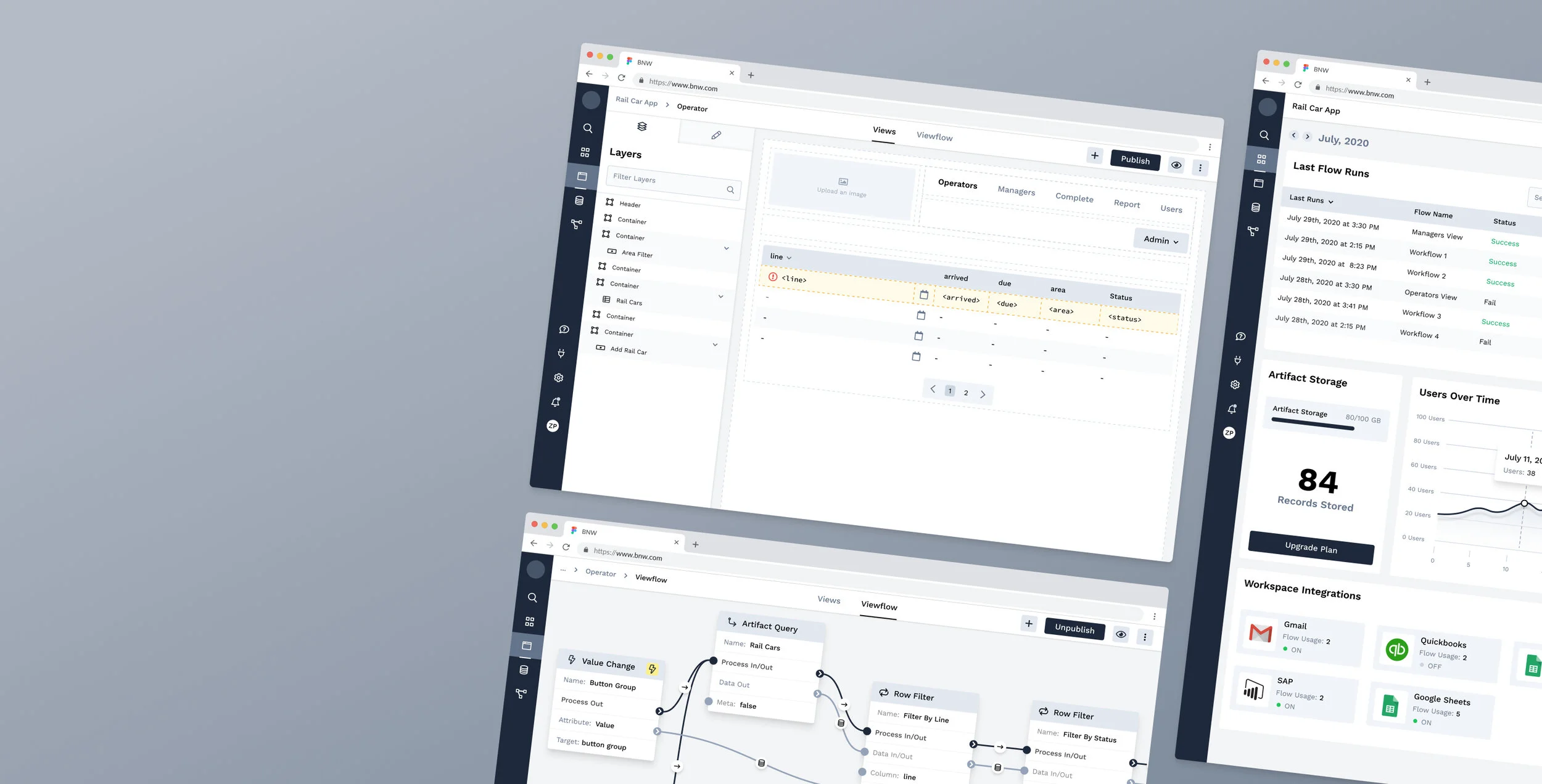
Views page
Creating a Design System
Using Figma and Tailwind CSS, I worked closely with our Lead Frontend Developer to create and implement a design system that is repeatable and follows the specs in our Tailwind CSS framework. I understand that every developer has their own process and it’s very important to me that I communicate with developers to understand how they prefer to work, how they want to receive assets and how my designs will translate to their code.
Final Solution
Using insights gained from usability testing, my team and I ideated solutions to resolve the user experience issues and improve the product. The multi-purpose sidebar navigation was changed to a static sidebar, breadcrumbs were added to all sub-pages so the users always know where they are in the navigation, the views canvas area was altered so that it was easier to distinguish the canvas area from the build tools, the properties panel, used to edit elements, was changed to make it easier to close.
Next Steps
Our next step was to validate that our changes improved the user experience and resolved the problems participants had during the first usability test. This is what we found:
Participants had a much easier time navigating through the application.
7/7 participants correctly understood when they were in a Workspace and when they weren't.
4/7 participants expected to be able to create pages from the Workspace dashboard, but we’re still able to find the Views (pages) tool in the primary navigation quickly after.
1 participant wasn’t able to create a page at all because he was looking for it on the Workspaces page.
1 participant wanted to visualize the parent-child page relationship in the form of a site map.
Overall the feedback was very positive. Test participants were, for the most part, easily able to complete their tasks and the resulting changes were fairly minimal.
Reflection
This project has been a huge learning opportunity for me and has pushed me to become a better designer over the past year! I’ve sourced and vetted test participants, written usability tests, interview scripts, conducted usability testing and user interviews. I’ve learned how to build a design system using Tailwind CSS as a framework, I’ve learned from talking to users and witnessing their pain points. I’ve learned from collaborating and presenting to my development team and other key stakeholders. Through this learning experience, I’ve also realized areas for improvement. I’ve realized that my low-fidelity designs are higher fidelity than they should be. Spending more time wireframing early on reduces the time it takes to make changes later.
This product continues to evolve and improve as my team and I iterate and ideate new features. I’m excited to see where this product goes and I believe in its potential to enable enterprises to build custom software at a fraction of the cost of conventional software development, or off-the-shelf ERP solutions.